您现在的位置是:网站首页> 编程资料编程资料
CSS 实现各种 Loading 效果附带解析过程10种CSS3实现的loading动画,挑一个走吧?CSS3制作3D立方体loading特效CSS3实现渐变的loading加载进度条特效代码CSS loading效果之 吃豆人的实现使用css实现android系统的loading加载动画
 2023-10-17
541人已围观
2023-10-17
541人已围观
简介 这篇文章主要介绍了CSS 实现各种 Loading 效果附带解析过程,本文给大家介绍的非常详细,对大家的学习或工作具有一定的参考借鉴价值,需要的朋友可以参考下
HTML
CSS
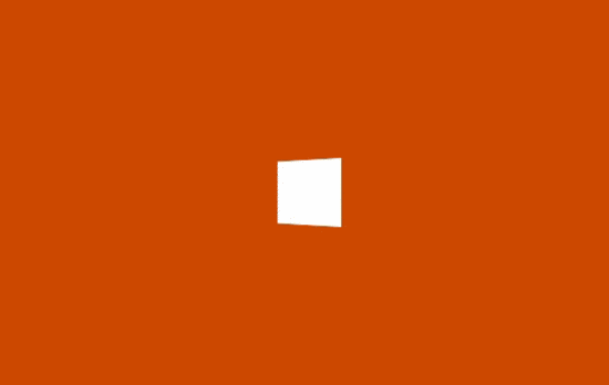
.spinner { width: 40px; height: 40px; background-color: #333; margin: 100px auto; -webkit-animation: sk-rotateplane 1.2s infinite ease-in-out; animation: sk-rotateplane 1.2s infinite ease-in-out; } @-webkit-keyframes sk-rotateplane { 0% { -webkit-transform: perspective(120px) } 50% { -webkit-transform: perspective(120px) rotateY(180deg) } 100% { -webkit-transform: perspective(120px) rotateY(180deg) rotateX(180deg) } } @keyframes sk-rotateplane { 0% { transform: perspective(120px) rotateX(0deg) rotateY(0deg); -webkit-transform: perspective(120px) rotateX(0deg) rotateY(0deg) } 50% { transform: perspective(120px) rotateX(-180.1deg) rotateY(0deg); -webkit-transform: perspective(120px) rotateX(-180.1deg) rotateY(0deg) } 100% { transform: perspective(120px) rotateX(-180deg) rotateY(-179.9deg); -webkit-transform: perspective(120px) rotateX(-180deg) rotateY(-179.9deg); } }解析:定义一个 div元素,设置边长为 40px 背景白色的正方形,然后设置循环翻转动画实现该加载效果动画
perspective 属性定义 3D 元素距视图的距离

HTML
CSS
.sk-chase { width: 40px; height: 40px; position: relative; animation: sk-chase 2.5s infinite linear both; } .sk-chase-dot { width: 100%; height: 100%; position: absolute; left: 0; top: 0; animation: sk-chase-dot 2.0s infinite ease-in-out both; } .sk-chase-dot:before { content: ''; display: block; width: 25%; height: 25%; background-color: #fff; border-radius: 100%; animation: sk-chase-dot-before 2.0s infinite ease-in-out both; } .sk-chase-dot:nth-child(1) { animation-delay: -1.1s; } .sk-chase-dot:nth-child(2) { animation-delay: -1.0s; } .sk-chase-dot:nth-child(3) { animation-delay: -0.9s; } .sk-chase-dot:nth-child(4) { animation-delay: -0.8s; } .sk-chase-dot:nth-child(5) { animation-delay: -0.7s; } .sk-chase-dot:nth-child(6) { animation-delay: -0.6s; } .sk-chase-dot:nth-child(1):before { animation-delay: -1.1s; } .sk-chase-dot:nth-child(2):before { animation-delay: -1.0s; } .sk-chase-dot:nth-child(3):before { animation-delay: -0.9s; } .sk-chase-dot:nth-child(4):before { animation-delay: -0.8s; } .sk-chase-dot:nth-child(5):before { animation-delay: -0.7s; } .sk-chase-dot:nth-child(6):before { animation-delay: -0.6s; } @keyframes sk-chase { 100% { transform: rotate(360deg); } } @keyframes sk-chase-dot { 80%, 100% { transform: rotate(360deg); } } @keyframes sk-chase-dot-before { 50% { transform: scale(0.4); } 100%, 0% { transform: scale(1.0); } }解析:定义一个父元素 div,内含六个白色实心圆点,添加旋转动画,通过设置不同的延迟时间来达到依次出现的效果

HTML
CSS
.spinner { width: 40px; height: 40px; position: relative; margin: 100px auto; } .double-bounce1, .double-bounce2 { width: 100%; height: 100%; border-radius: 50%; background-color: #333; opacity: 0.6; position: absolute; top: 0; left: 0; -webkit-animation: sk-bounce 2.0s infinite ease-in-out; animation: sk-bounce 2.0s infinite ease-in-out; } .double-bounce2 { -webkit-animation-delay: -1.0s; animation-delay: -1.0s; } @-webkit-keyframes sk-bounce { 0%, 100% { -webkit-transform: scale(0.0) } 50% { -webkit-transform: scale(1.0) } } @keyframes sk-bounce { 0%, 100% { transform: scale(0.0); -webkit-transform: scale(0.0); } 50% { transform: scale(1.0); -webkit-transform: scale(1.0); } }解析:两个子元素 div 实现半透明的圆形,设置绝对定位重叠在一起,然后设置相同的动画通过不同的延迟时间交替放大缩小。
HTML
CSS
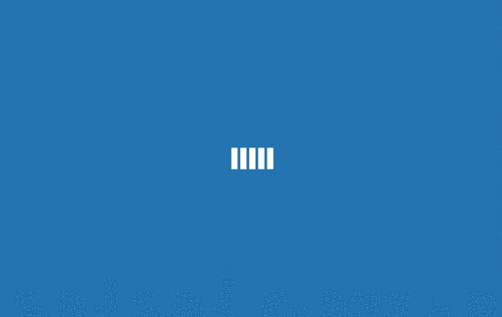
.spinner { margin: 100px auto; width: 50px; height: 40px; text-align: center; font-size: 10px; } .spinner > div { background-color: #333; height: 100%; width: 6px; display: inline-block; -webkit-animation: sk-stretchdelay 1.2s infinite ease-in-out; animation: sk-stretchdelay 1.2s infinite ease-in-out; } .spinner .rect2 { -webkit-animation-delay: -1.1s; animation-delay: -1.1s; } .spinner .rect3 { -webkit-animation-delay: -1.0s; animation-delay: -1.0s; } .spinner .rect4 { -webkit-animation-delay: -0.9s; animation-delay: -0.9s; } .spinner .rect5 { -webkit-animation-delay: -0.8s; animation-delay: -0.8s; } @-webkit-keyframes sk-stretchdelay { 0%, 40%, 100% { -webkit-transform: scaleY(0.4) } 20% { -webkit-transform: scaleY(1.0) } } @keyframes sk-stretchdelay { 0%, 40%, 100% { transform: scaleY(0.4); -webkit-transform: scaleY(0.4); } 20% { transform: scaleY(1.0); -webkit-transform: scaleY(1.0); } }解析:在类名为 spinner元素下有五个 div 实现的长方形元素,设置Y轴的缩放,通过不同的延迟时间来达到依次变化的效果。
HTML
CSS
.cube1, .cube2 { background-color: #333; width: 15px; height: 15px; position: absolute; top: 0; left: 0; -webkit-animation: sk-cubemove 1.8s infinite ease-in-out; animation: sk-cubemove 1.8s infinite ease-in-out; } .cube2 { -webkit-animation-delay: -0.9s; animation-delay: -0.9s; } @-webkit-keyframes sk-cubemove { 25% { -webkit-transform: translateX(42px) rotate(-90deg) scale(0.5) } 50% { -webkit-transform: translateX(42px) translateY(42px) rotate(-180deg) } 75% { -webkit-transform: translateX(0px) translateY(42px) rotate(-270deg) scale(0.5) } 100% { -webkit-transform: rotate(-360deg) } } @keyframes sk-cubemove { 25% { transform: translateX(42px) rotate(-90deg) scale(0.5); -webkit-transform: translateX(42px) rotate(-90deg) scale(0.5); } 50% { transform: translateX(42px) translateY(42px) rotate(-179deg); -webkit-transform: translateX(42px) translateY(42px) rotate(-179deg); } 50.1% { transform: translateX(42px) translateY(42px) rotate(-180deg); -webkit-transform: translateX(42px) translateY(42px) rotate(-180deg); } 75% { transform: translateX(0px) translateY(42px) rotate(-270deg) scale(0.5); -webkit-transform: translateX(0px) translateY(42px) rotate(-270deg) scale(0.5); } 100% { transform: rotate(-360deg); -webkit-transform: rotate(-360deg); } }解析:两个子元素实现白色的方块,添加动画属性,在X轴和Y轴分别设置移动距离和缩放,通过不同的延迟时间来分离他们,rorate实现围绕中心旋转。

HTML
CSS
.spinner { width: 40px; height: 40px; margin: 100px auto; background-color: #333; border-radius: 100%; -webkit-animation: sk-scaleout 1.0s infinite ease-in-out; animation: sk-scaleout 1.0s infinite ease-in-out; } @-webkit-keyframes sk-scaleout { 0% { -webkit-transform: scale(0) } 100% { -webkit-transform: scale(1.0); opacity: 0; } } @keyframes sk-scaleout { 0% { -webkit-transform: scale(0); transform: scale(0); } 100% { -webkit-transform: scale(1.0); transform: scale(1.0); opacity: 0; } }解析:唯一的 div元素实现白色背景圆点,通过设置缩放和透明度实现呼吸灯的效果。

HTML
CSS
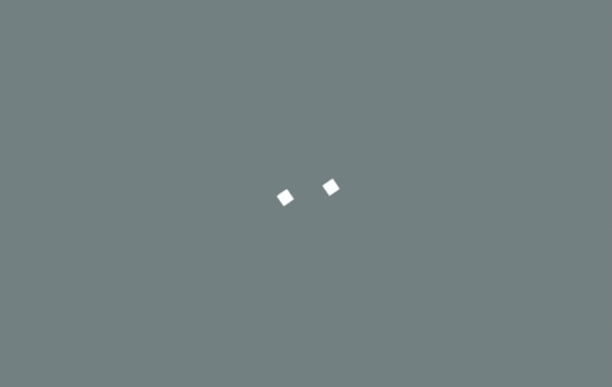
.spinner { margin: 100px auto; width: 40px; height: 40px; position: relative; text-align: center; -webkit-animation: sk-rotate 2.0s infinite linear; animation: sk-rotate 2.0s infinite linear; } .dot1, .dot2 { width: 60%; height: 60%; display: inline-block; position: absolute; top: 0; background-color: #333; border-radius: 100%; -webkit-animation: sk-bounce 2.0s infinite ease-in-out; animation: sk-bounce 2.0s infinite ease-in-out; } .dot2 { top: auto; bottom: 0; -webkit-animation-delay: -1.0s; animation-delay: -1.0s; } @-webkit-keyframes sk-rotate { 100% { -webkit-transform: rotate(360deg) }} @keyframes sk-rotate { 100% { transform: rotate(360deg); -webkit-transform: rotate(360deg) }} @-webkit-keyframes sk-bounce { 0%, 100% { -webkit-transform: scale(0.0) } 50% { -webkit-transform: scale(1.0) } } @keyframes sk-bounce { 0%, 100% { transform: scale(0.0); -webkit-transform: scale(0.0); } 50% { transform: scale(1.0); -webkit-transform: scale(1.0); } }解析:两个实心圆形围绕中心做循环的缩放旋转运动,因为不同的延迟时间来达到它们同一时间呈现相反的表现。

HTML
相关内容
- 如何通过 display:olck/none 完成一个菜单栏使用layui实现左侧菜单栏及动态操作tab项的方法Html+Css+Jquery实现左侧滑动拉伸导航菜单栏的示例代码使用HTML+CSS实现鼠标划过的二级菜单栏的示例详解css3 Transition属性(平滑过渡菜单栏案例)菜单栏 “三” 变形为“X”css3过渡动画利用CSS实现几款不错的菜单栏实例代码CSS仿网易首页的头部菜单栏按钮和三角形制作方法纯CSS制作菜单栏当鼠标经过时会变色的利用html+css实现菜单栏缓慢下拉效果的示例代码
- CSS3中的弹性布局em运用入门详解 1em等于多少像素解决ElementUI自定义CSS样式不生效的问题CSS伪类:empty让我眼前一亮(实例代码)CSS使用BEM命名规范实践css 命名:BEM, scoped css, css modules 与 css-in-js详解CSS规范BEM CSS和OOCSS的示例代码详解CSS中em的正确打开方式详解
- css中的px、em、rem、pt 特点和区别及换算详解postcss-pxtorem移动端适配的实现移动端适配 使px自动转换remCSS中px em rem区别与使用css3中单位px,em,rem,vh,vw,vmin,vmax的区别及浏览器支持情况CSS 中px、em、rem、%、vw、vh单位之间的区别详解
- 九阴真经无根门出师的条件和好处详细介绍_手机游戏_游戏攻略_
- 全民飞机大战什么时候能玩 全民飞机大战活动礼包领取方法_手机游戏_游戏攻略_
- 天天飞车 超级模式怎样开启 超级模式有什么作用_手机游戏_游戏攻略_
- 刀塔传奇 小鹿好不好 小鹿技能有哪些_手机游戏_游戏攻略_
- 全民飞机大战道具使用方法攻略介绍_手机游戏_游戏攻略_
- 全民飞机大战攻略之 哪个宠物更好 全民飞机大战抓抓/小旋风性能比_手机游戏_游戏攻略_
- 全民飞机大战葫芦侠刷分刷金币方法图文详解_手机游戏_游戏攻略_
点击排行
本栏推荐